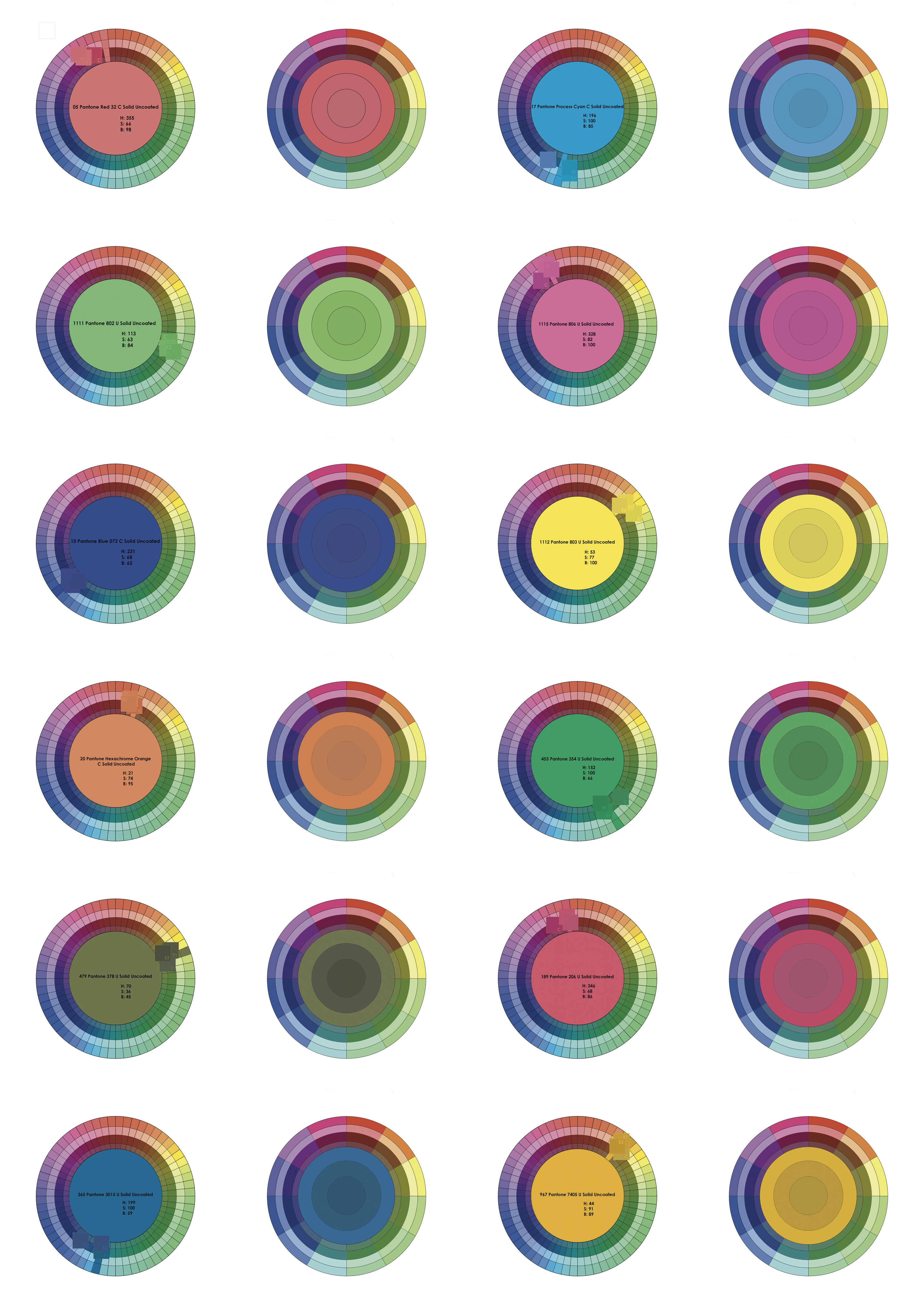
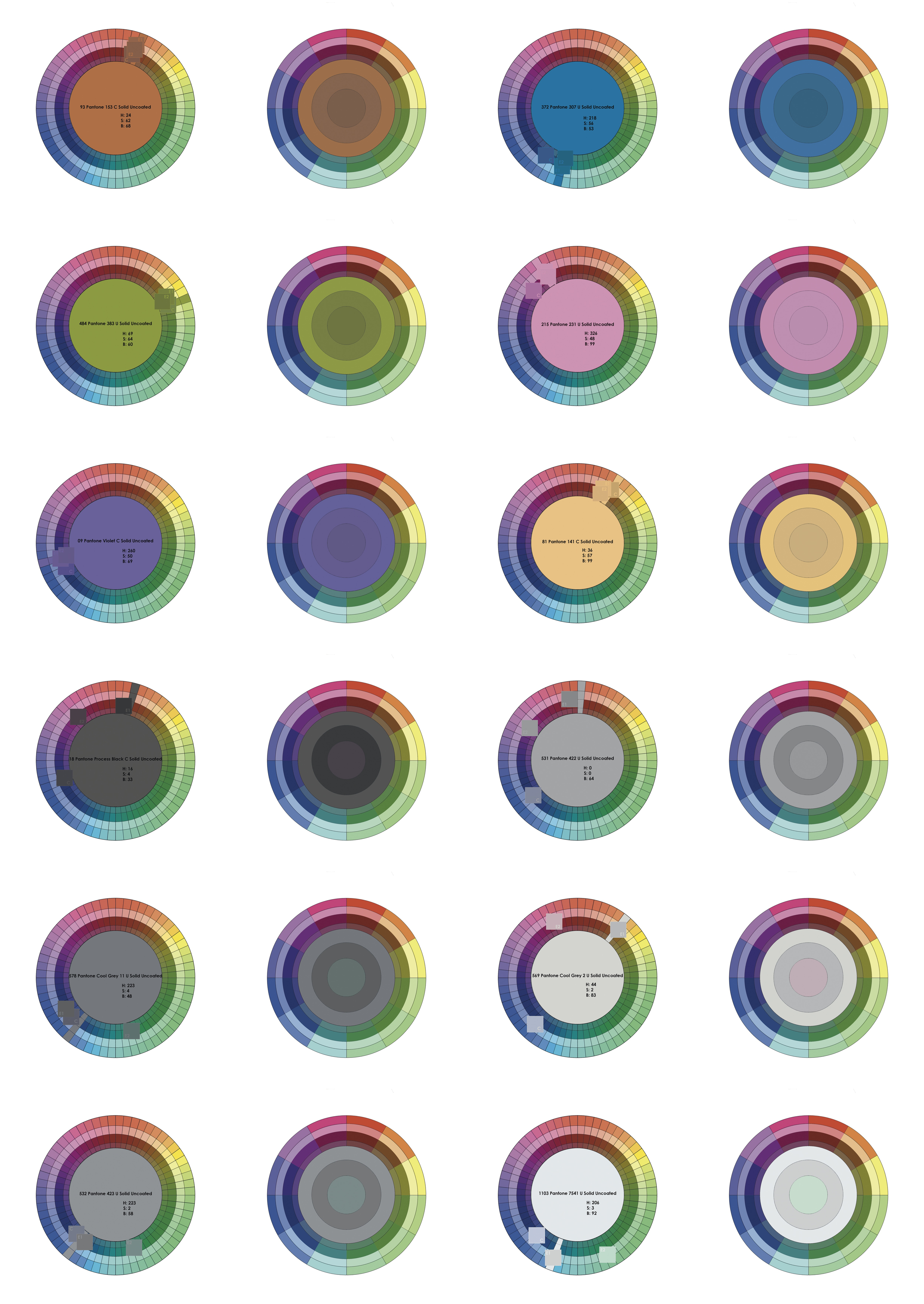
This exposition presents 48 colour maps signifying the hue, saturation and brightness (HSB) differences between a screen colour and the resulting colour outcome when printing onto fabric with a digital inkjet textile printer. Each map is a 360 degree hue colour circle that has inner rings decreasing in saturation and brightness.
Digital screen colour, a mix of red, green and blue light, has a broader colour range to printed colour, primarily a mix of cyan, magenta, yellow and black pigment primaries. Whilst there are overlaps between the two colour spaces there are many colours possible in one but not the other, thus out of gamut.
Colour results are further affected by factors such as structure and composition of the fabric, dye type, printer communications, fabric pre-treatments and secondary processes. A textile designer will be required to understand and experiment with a number of variables in order to feel colour confident.
Digital textile inkjet printing (DTIP) is a non surface-impact print process where colorants (primarily dyes, but increasingly pigment inks) are jetted in a dithered, matrix of dots, onto specially treated fabric, to create the appearance of solid colour. The colorant sits on the surface, although, secondary processes, allow dye molecules to further permeate the fibres. Additionally, DTP may include dye sublimation, solvent, latex, ultra-violet and direct-to-garment printing, for example T-shirt printers.
These diagrams visualise the results of initial gamut mapping exercises to explore the colour shifts for a set of Pantone colours printed onto wool (w), linen (l), cotton(c) and silk (s) using reactive dyes. Spectrodensitometer measurements of these prints were used to translate the printed colour into digital data.
Each hue has two maps. The left map visualises the print data, to identify the shift from the intended colour, circle centre, and resulting colour, outer circle, one square per substrate. The right map represents two overall colour shift expectations, centre circle and encompassing circle, from the screen colour which circulates these. The shifts use a median average of the value difference from screen to substrate from two data sets, one which includes wild card values and one without.
The colour maps, or digital lab dip tests, provide an indication of how colour might alter in hue, saturation and brightness when printing upon different textile substrates. DTP is primarily an outsourced process which impedes users’ knowledge of the systems and challenges involved in achieving colour results. The colour maps may be used as a pedagogical tool, providing designers and SMEs with a visualisation of expected colour shifts, allowing them to make amendments to design work prior to printing, and managing expectations of printed colour outcomes.
The selection of colour maps in this exposition represent key colours from a colour rendition chart created by Dr Phil Henry at the University of Leeds. Colour rendition charts were created as visual evaluation tools for the photographic, television and printing industries. They are made up of a set of essential colours based on RGB and CMYK primaries, and colours that are challenging to reproduce.
This work was supported by the 3D3 Research Centre for Doctoral Training, funded by the Arts and Humanities Research Council, UK.