
Process
“Just as water, gas, and electricity are brought into our houses from far off to satisfy our needs in response to a minimal effort, so we shall be supplied with visual or auditory images, which will appear and disappear at a simple movement of the hand, hardly more than a sign.”
-Walter Benjamin,1936

Picture of my personal library.
Recognizing Earlier Versions and Extensions of the Apparatus

Early notes.
Getting to Know the Apparatus
During my first session, I experimented with the apparatus in order to see what it could do. Note the web-like tracking system which enables panels to be moved with relative freedom around the room.
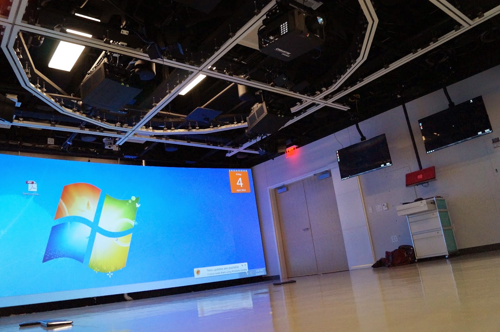
North Studio ceiling. (Photo courtesy of Jason Jefferies.)
Testing Content
I used two photographs of some glass dishes I’d come across while wandering Asheville’s galleries many years ago. They made testing pretty.

Stained glass projected on early configuration. (Photos courtesy of Jason Jefferies.)
Optical Illusions
The floor became part of the canvas as well. I looked at the picture above several times thinking it was someone's coffee cup. It wasn't until I was editing it in Photoshop that I realized it was part of the projected desktop.

Apple's waste basket projected onto the floor.
(Photo courtesy of Jason Jefferies.)
Realizing It’s Quite a Clever Apparatus
The South Midi and North Midi projectors actually swap canvases when the doors are placed in an open formation. The glass in these doors reflect and display the projected images, creating a layering effect.

Early configurations and experiments: a streetlamp emerges at the end of a corridor of text.
2-D Becomes 3-D (and then 4-D)
I was reminded that the size of an image depends on the distance between the surface and the projector, and that gaps in surfaces give a 2-dimensional image 3-dimensional qualities.

Cnn.com projected onto an early configuration. (Above photo, courtesy of Jason Jefferies.)
Creating Surreal Contexts
Strange combinations of headlines and furniture create new perspectives for viewing text.

Above photo, Cnn.com projected onto floor. (Photo courtesy of Jason Jefferies.)
The Apparatus Extends Into My Office
I extended my experience of the apparatus to my own home office, which I configured as pictured. I chose not to use screen shots because I wanted the texture of the computer screen to be visible.

One arrangement of camera and monitors as I mined the internet for images.
The Search for Content
Strange combinations emerged in my virtual wanderings. I edited the photos using Photoshop so as to capture interesting juxtapositions and eye-catching textures and colors.


Raw shots of the monitor: these would be cropped and color edited in Photoshop before being format to fit the various components of the Creativity Studio.

Strange intersections of found art and old photographs.
Framing & Selection
As I wandered through the virtual arcades of Google search results and the random divagations they brought forth, I looked for moments of aesthetic pleasure. The white backgrounding outlining the image searches I ran sectioned off the chaos of content into captured moments that could be remediated when projected onto the apparatus.


Above are pictured various cropped and color edited shots of the original photos I took of my computer monitor. In some cases I left the web URL as part of the picture, along with the search term used to generate the images.
Testing Content & Configuration
I visited the Hunt Library five times during the writing process, adjusting the surfaces and experimenting with different arrangements and slides.

Graffiti and some strange Steampunk-style skull sculpture in the background. (Photo courtesy of Jason Jefferies.)
Moving the Panels and Doors
I learned that the revolving doors are not only projection surfaces but can also reflect light onto the side walls, combining to create a 360-degree virtual environment at the center point where they converge. Note the manner in which images are broken up and reassembled in new configurations by the staggered arrangement of the projection surfaces. (Play video above.)
ABOVE: Click image to play video of experimentation and setup for April 5, 2014.
The Most Natural Fits
I ended up choosing the content that most naturally reflected the thematic interests of the project as these images most emphasized the relationship between image and surface. I focused on images that were relevant to Walter Benjamin’s times, as well as modernizations of the sort of everyday art of the publically-accessible world that his writings had helped me to see—graffiti, advertisements, propaganda, and canonized artworks, to name a few.
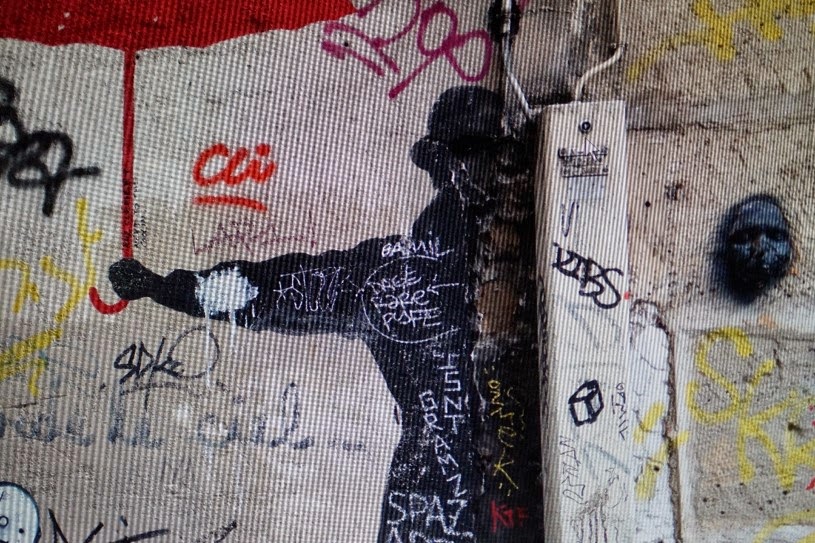
A picture of some graffiti I found while wandering the internet. Graffiti projected more beautifully than any other type of image onto the apparatus. The texture of the computer monitor blends interestingly with the texture of the cement wall.
Remediating the Remediated
Some chance encounters in my virtual wanderings resulted in shots that were both relevant to and reflective of the space in which I was working. Above, one can see the revisiting of Warhol’s soup cans as they might be projected onto a train car. The windows and clefts in the train’s surface resemble the windows and separating panels I was working with in the studio and helped me imagine how they too may break up space and reintroduce the art we have grown used to.
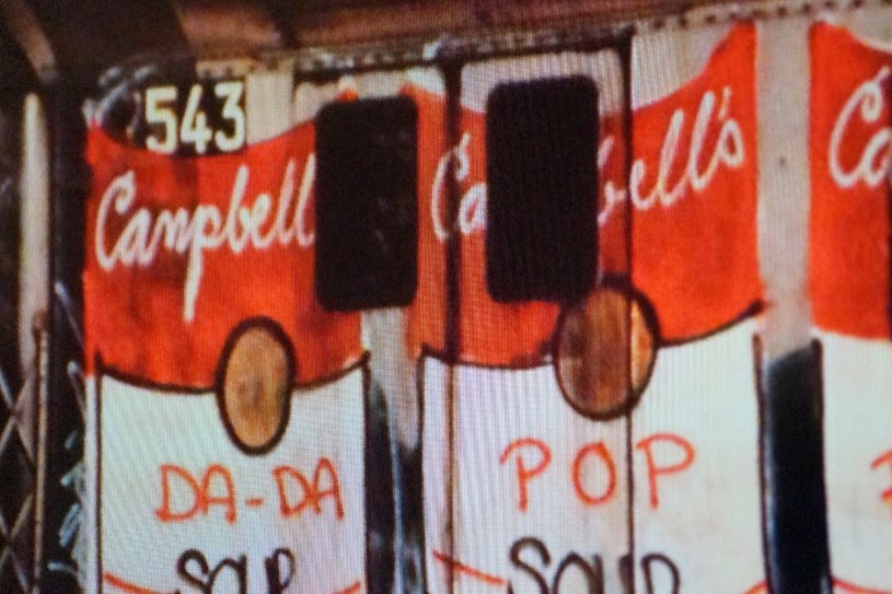
Train art meets Andy Warhol. Screen creates strange curvature in the image revealing that it was shot from the floor.
Collage
I constructed several collages of small parts in addition to creating slides of cropped content so as to vary the image sizes to be used in the slideshows for the apparatus. While each is somewhat generated by artificial intelligence in the sense that they were selected by a search engine, the collages rework and reframe patterns and arrangements in ways that defamiliarize the data and emphasize aspects of its content as artistically constructed.

Stacked images.
Landscapes & Hue Saturation
Some choices were driven simply by personal preferences and tastes. I took the time to edit several cropped search photos in order to create color combinations I found interesting or that blended well with the studio lighting options available. Above, I altered the colors of the images so that the ocean would appear a distressful green. When projected onto the large walls, these images take on a landscape quality.

A striking image made toxic.
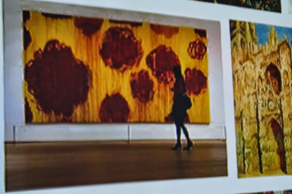
Original Paintings and Photographs
I chose to use some landscape photos from my own personal collection in order to contrast these with the virtual landscapes encountered in my online wanderings. I also used parts of my paintings, a few snapshots of old friends who wandered widely with me, and textured surfaces that were started but never finished. I was afraid these large unified images would be jarring against the collages, but it turned out that the apparatus split up the images enough that they appeared similar to the others.


Above images are from my personal collection. I chose them for their landscape qualities. They contrasted the split-up world of framed search results with a broad-stroked wholeness that fractured inside the apparatus at various vantage points.
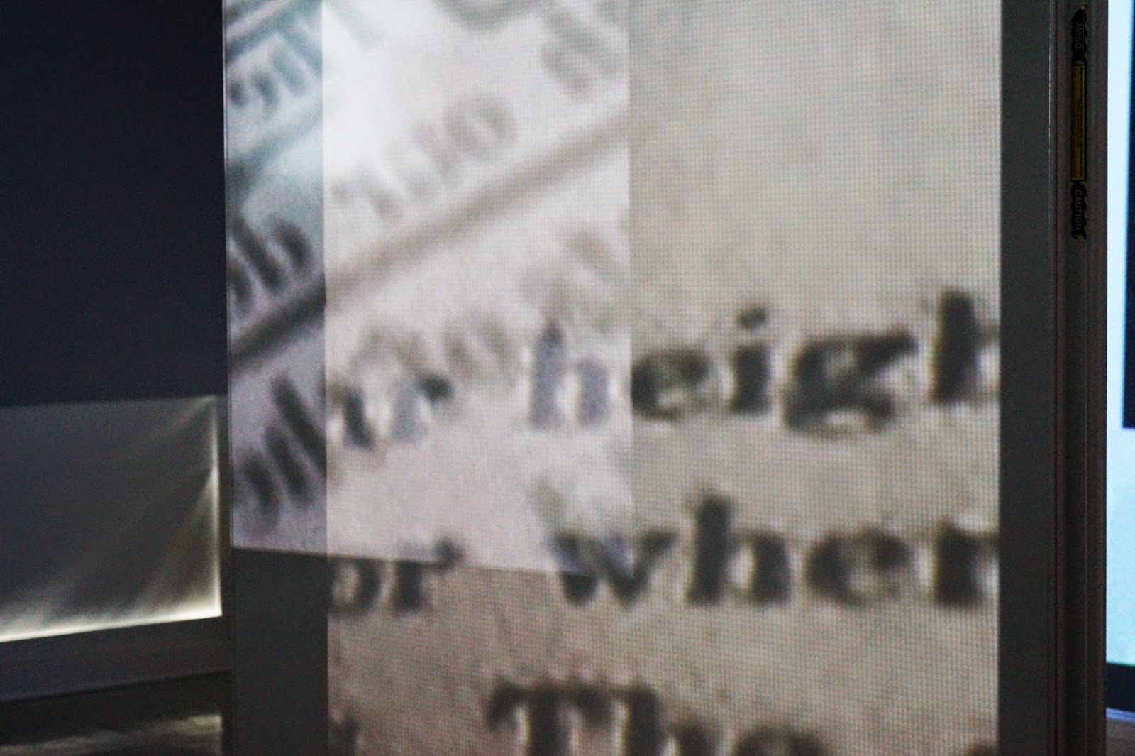
Photographs of Books and Online Text
I used many photographs from my personal library. Sometimes I tried to find passages that spoke to the arcades. Other times, I just photographed the book; content was secondary to the shadows on the page or the marginalia. When projected onto the apparatus, these images of text broke into parts, mixing with the images in foreground and background, mirroring the way we experience text in everyday life.


Above, blurred photos, of The Arcades Project. These created an interesting effect when projected onto the more complex parts of the apparatus.


Above photos, courtesy of Jason Jefferies.
Finalizing the Apparatus
The final version of the installation is comprised of six Powerpoint presentations. All content was accessed using Dropbox. In the next few slides, I have altered the Magnolia schematic to help identify landmarks for a reinstallation.