Contested urban identities: branding and antagonism in the city of Porto
Ana Miriam Rebelo | Heitor Alvelos


After decades of neglect and material decay, the city of Porto entered a period of rapid transformations that changed its physical environment, its economic activity, and social fabric. Porto went from being a relatively ignored city, to “UNESCO World Heritage Site”, to “European Capital of Culture”, to “Best European Destination” [1] ... in only two decades. As these transformations swiftly take place before their eyes, citizens try to adapt to changing living conditions and to accommodate the city’s new identity into their self-histories amidst a pervading sense of fakery. Many of them have left because the city where once it was hard to find a flat because the rental market was almost non-existent, became the city where it is hard to rent a flat because average incomes cannot afford it.
Tensions arise between citizens' needs and market imperatives. The city as home conflicts with the city as a destination, as a theme park, as a commodity, as a financial asset. Between the glorification of a certain “city identity” constantly replayed in promotional discourses, and the growing suspicion that some true(r) identity may be at risk, fundamental questions arise: who is entitled to issue and validate collective identity representations and ultimately, who do they represent?
“PORTO.” - Branding the city
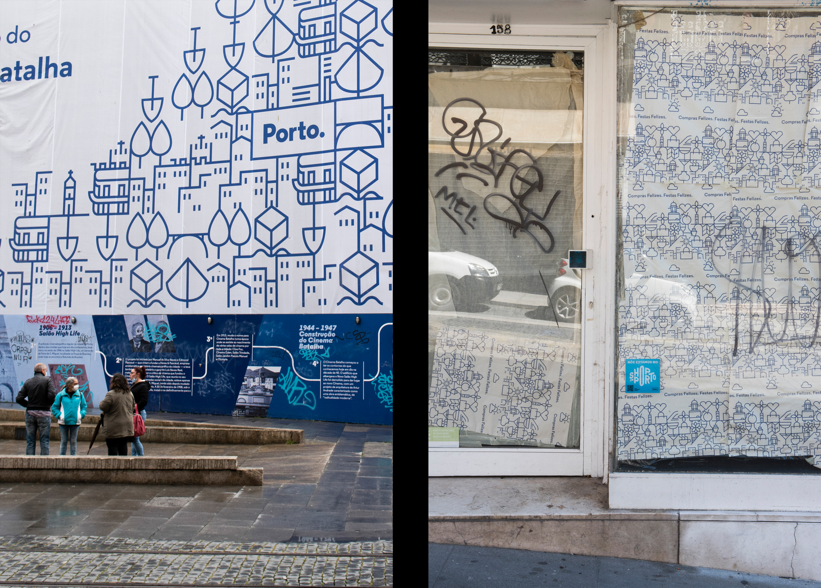
In 2014, shortly after the first election of the current municipal executive, the city of Porto was presented with its new “visual identity”. Responding to a globally declared necessity to brand cities in order to position them in a highly competitive international market, the City Council commissioned a graphic image that would promote the city as a tourist destination and investment target. Yet at the same time, this graphic identity is also supposed to represent the City Council before the citizens and to provide them with an image by which everyone may feel represented. “Too much Porto for a graphic image”[2] admitted one of the brand’s promoters - only to conclude it was possible after all.
Heavy investment was made on the brand’s placement, namely through a massive presence in public space. All over the city, 600 billboards displayed the new graphic identity, while applications on light rail vehicles reached beyond the city’s limits.Large three-dimensional logos were placed in tourist hotspots, as unavoidable selfie backgrounds. The labeling of municipal buildings and vehicles, council workers, and construction sites has since become routine. Porto met “Porto ponto” [Porto period].
The ubiquity of the brand’s presence, associated with the reproduction of global narratives on urban development, and the capitalization on local historical tensions, asserted the brand’s hegemony as a representation of the city. Less visibly, two strategies worked towards its consolidation: the attempt to naturalize the brand, and the deliberate intent to blur the distinction between the City Council, and the city as a whole.
Although the brand was created and implemented according to a top-down strategy [3], it was presented as “something intrinsic to the city”, something the city itself made [4]. Once naturalized, and thus acritically validated, the brand acts as a link between the City Council and the city itself, proposing an equivalence that obscures the possibility that the council’s priorities may not always correspond to public interest. The symbolic merging of the two concepts and entities is blatantly evident in the City Council’s appropriation of one of the logos that was originally assigned to the city. Although the Council has a specific logo that unmistakably represents it, it deliberately reserves it to official paperwork. In public space, it “signs as the city” [5].
By engineering a consensus around an idealized identity, the brand’s promoters downplay the existence of conflicting visions, deterring public criticism, while re-affirming the inevitability of a hegemonic urban development model. However, as argued by Doreen Massey “places do not have single, unique 'identities'; they are full of internal conflicts” [6]. The following section addresses local expressions of dissent that subvert the “Porto.” brand, turning it into an instrument for debate and scrutiny” [7].
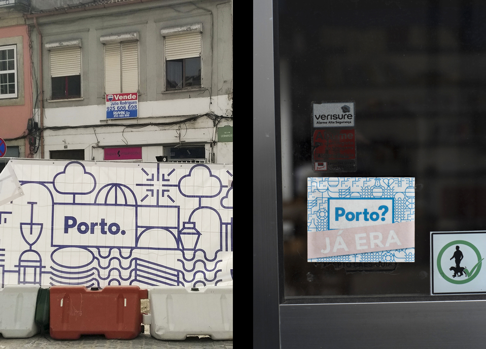
“MORTO.” - Subversive antagonism
In the summer of 2017, amidst the usual polyphonic hubbub of the city’s walls, a few small stickers caught the city’s eye and prompted controversy. They peeked from poles and façades, defying the gigantic banners that wrap buildings with the city’s graphic image during unsightly rehabilitation, imposing themselves even on the most distracted passers-by. The city’s celebrated logo had been subverted into a sharp critical message, targeting the City Council and the effects of its urban development strategy. Changing only one letter “Porto.” was turned into “Morto.” [Dead].
These small interventions would have remained short-lived murmurs, had they not been amplified by the mayor’s outraged reaction on social media, accusing the authors of hating the city. In a recurrent diversionary movement, he turned criticism towards himself and his executive into an attack on the city. A complaint was filed against unknown offenders and the stickers were removed.
Inevitably, wiping contestation from public space only made it more visible online, and brought back to life previous subversions, already faded from the city’s walls. Predictably, it further stimulated the production of new subversions. The plasticity of the city’s name and the growing evidence of urban inequalities invited playful criticism, while the logo’s ubiquity ensured the subversions' effectiveness.
In opposition to the brand’s projected image of a consensual city where common prosperity thrives, the subversions succeeded in raising necessary debate and bringing controversial issues to public attention. They reclaimed social and aesthetic diversity in a lived-in, participated city, against a hegemonic development model that conceives the city as a competitive product in a global market. Perhaps their most effective contribution was given to the quality of the city’s democratic life, by reclaiming the right to participate and be heard, while denying the brand and the Council a monopoly over the representations and constructions of the city.
Notes
- 1. Porto was elected “European Best Destination” in 2012, 2014, and 2017, a distinction awarded by a website dedicated to European tourism promotion. Campaigns were launched to support the city’s candidature and the awards were much celebrated and publicized by the City Council.
- 2. Nuno Nogueira Santos. Porto. Manual de Identidade. 2017.
- 3. Beatriz Casais & Patrícia Monteiro. “Residents’ involvement in city brand co-creation and their perceptions of city brand identity: a case study in Porto”. Place Branding and Public Diplomacy, 15(4). 2019.
- 4. Eduardo Aires. Porto. Manual de Identidade. 2017.
- 5. Nuno Nogueira Santos. “European Design Destination” Interviewer: C. Fernandes. ROOF – An IN & OUT Magazine.
- 6. Doreen Massey. “A global sense of place”. Marxism Today. 1991.
- 7. Francisco Laranjo. “Algumas notas sobre o Morto.” Público. (2017, 29/08/2017).
Acknowledgements
This article is part of the research project “Visual and semantic identities of the city of Porto: an ascertainment of the contributions of informal dwelling”, funded by the Foundation for Science and Technology (FCT) and the European Social Fund (ESF), under the grant PD/BD/150641/2020.
The following people generously contributed to this article with their images: 3 Pontinhos, Inês Barbosa, Luís Camanho, Pedro Ferreira and Pedro Figueiredo. To all of them, many thanks.