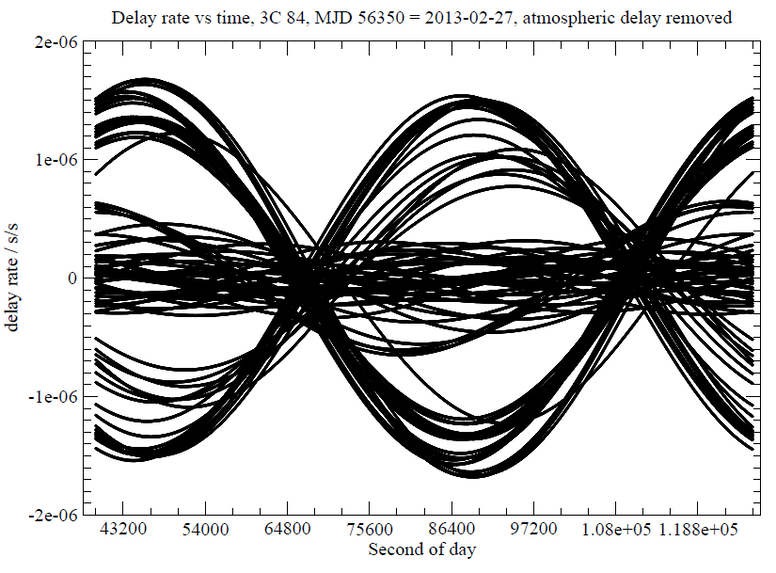
Fringe rate
In VLBI, the crests and troughs of the interference pattern (as mentioned in relation to the amp/phase measurements) are called fringes. The way that this interference pattern changes according to the movement of the antennas is called the fringe rate, and it is an expression of the rate of change of the delay time between two antennas. During one full rotation of the earth, the fringe rate for a pair of antennas will describe a nice sinusoid waveform. Here we can see the fringe rates for several pairs of antennas, over an experiment duration of 24 hours.
To me, one remarkable feature of this figure is that we have several curves clumped together in the middle, at low amplitude, and we have a group of high amplitude curves, but very little in the medium range in between those groups. I asked Alan and Alessandra at the Max Planck Institute about this, and they immediately replied: Well, what we see is an image of the uneven distribution of resources on planet earth, as seen from a distance of a billion light years. We have a cluster of antennas in central Europe, another cluster in the USA, and some in the south eastern Asia. Otherwise there are long distances between the antennas, and this shows in the fringe rate figure here.
In the sound installation, I’ve mapped the fringe rate curves to the frequency of a set of oscillators, creating a pitch sweep following the fringe rate curve for each pair of antennas. This creates a very dense cluster sound, but with some patience you should be able to hear the relation between the graphical figure here and the sound. Now, is this the sound of uneven distribution of wealth on planet earth?